

Ever wondered what company logos mean and whats the significance behind them? Wonder no more!
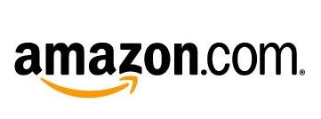
You might think the arrow does nothing here. But it says that amazon.com has everything from a to z and it also represents the smile brought to
the customer’s face. Wow, that is quite deep.
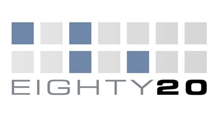
Eighty-20 is a small consulting company which does sophisticated financial modeling, as well as some solid database work. All their work is highly quantitative and relies on some serious computational power, and the logo is meant to convey it.
People first guess that 20% of the squares are darkened, but that turns out to be false after counting them. The trick is to view the dark squares as 1’s and the light squares as 0’s. Then the top line reads 1010000 and the bottom line reads 0010100, which represent 80 and 20 in binary.
Kinda like the surreal green screen of The Matrix, they want us to read stuff in binary

Am not sure how many of you have noticed a hidden symbol in the Federal Express logo.
Yeah, I am talking about the ‘arrow’ that you can see between the E and the x in this logo. The arrow was introduced to underscore speed and precision, which are part of the positioning of the company.
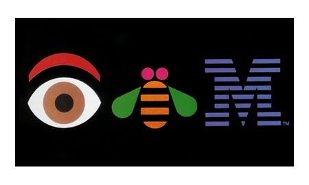
Paul Rand (who designed the iconic IBM logo in 1972) designed this ‘eye bee M’ logo in 1981. I like that they are quite relaxed about the logo, unlike certain other companies who do not like the logo to be tampered with in any way even for internal promotions
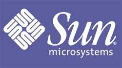
The SUN Microsystems logo is a wonderful example of symmetry and order. It was a brilliant observation that the letters u and n while arranged adjacent to each other look a lot like the letter S in a perpendicular direction. Spectacular.

The above are two magazines from the Readers Digest stable. Again, the attempt to communicate what it is about quite figuratively through the logo catches my attention.
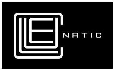
This was a logo created for a puzzle game called Cluenatic. This game involves unravelling four clues. The logo has the letters C, L, U and E arranged as a maze. and from a distance, the logo looks like a key
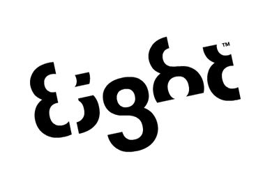
This logo is too good. For the name Eight, they have used a font in which each letter is a minor adaptation of the number 8.
History Of Company Names
Hewlett-Packard

Bill Hewlett and Dave Packard tossed a coin to decide whether the company they founded would be called Hewlett-Packard or Packard-Hewlett.
Yahoo!

The word was invented by Jonathan Swift and used in his book Gulliver’s Travels. It represents a person who is repulsive in appearance and action and is barely human. Yahoo! Founders Jerry Yang and David Filo selected the name because they considered themselves yahoos.
Xerox

The Greek root “xer” means dry. The inventor, Chestor Carlson, named his
Product Xerox as it was dry copying, markedly different from the then prevailing
Wet copying.
Sun Microsystems

Founded by four Stanford University buddies, Sun is the acronym for Stanford University Network.
Sony
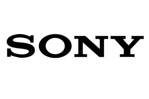
From the Latin word ‘sonus’ meaning sound, and ‘sonny’ a slang used by Americans to refer to a bright youngster.
SAP
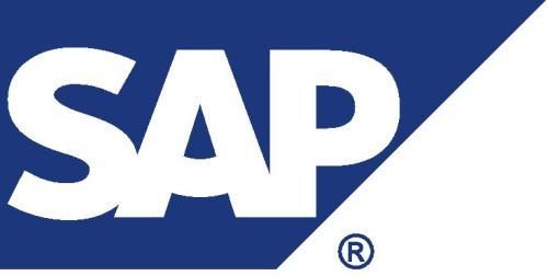
“Systems, Applications, Products in Data Processing”, formed by four ex-IBM employees who used to work in the ‘Systems/Application s/Projects’ group of IBM.
Red Hat
Company founder Marc Ewing was given the Cornell lacrosse team cap
(with red and white stripes) while at college by his grandfather. He lost it and
Had to search for it desperately. The manual of the beta version of Red Hat
Linux had an appeal to readers to return his Red Hat if found by anyone!
Oracle
Larry Ellison and Bob Oats were working on a consulting project for the Central Intelligence Agency (CIA). The code name for the project was called Oracle (the
CIA saw this as the system to give answers to all questions or something such).
Motorola
Founder Paul Galvin came up with this name when his company started manufacturing radios for cars. The popular radio company at the time was
Called Victrola.
Microsoft
It was coined by Bill Gates to represent the company that was devoted to MICROcomputer SOFTware. Originally christened Micro-Soft, the ‘-‘ was
Removed later on.
Love Daily Emails? Click Here to Join Group…
Lotus
Mitch Kapor got the name for his company from the lotus position or ‘padmasana.’ Kapor used to be a teacher of Transcendental Meditation of Maharishi Mahesh Yogi.
Intel
Bob Noyce and Gordon Moore wanted to name their new company ‘Moore Noyce’ but that was already trademarked by a hotel chain, so they had to settle for an acronym of INTegrated ELectronics.
Hotmail
Founder Jack Smith got the idea of accessing email via the web from a computer anywhere in the world. When Sabeer Bhatia came up with the business plan for
The mail service, he tried all kinds of names ending in ‘mail’ and finally settled for Hotmail as it included the letters “HTML” – the programming language used to
Write web pages. It was initially referred to as HoTMaiL with selective upper casings.
The name started as a jockey boast about the amount of information the search-engine would be able to search. It was originally named ‘Googol’, a word for the number represented by 1 followed by 100 zeros. After founders – Stanford graduate students Sergey Brin and Larry Page presented their project to an angel investor, they received a cheque made out to ‘Google
Cisco
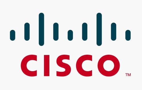
The name is not an acronym but an abbreviation of San Francisco. The company’s logo reflects its San Francisco name heritage. It represents a stylized Golden Gate Bridge.
Apple Computers
Favourite fruit of founder Steve Jobs. He was three months late in filing a name for the business, and he threatened to call his company Apple Computers if the other colleagues didn’t suggest a better name by 5 o’clock.
Apache
It got its name because its founders got started by applying patches to code written for NCSA’s httpd daemon. The result was ‘A PAtCHy’ server – thus, the name Apache.
Adobe
The name came from the river Adobe Creek that ran behind the house of founder John Warnock
Regards,
Rajesh Acharya
8 Fish
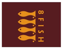
Four fish in orange are clear and evident but on a closer look you will see 4 more fish in opposite direction.
5.10
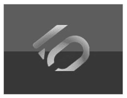
When seen in upside position the logo shows a very clever blend of the numeric?s of 5 and10.
ASP
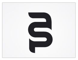
The logo shows merger of the lower case letters “A”, “S” and “P”. I think the first two letters are quiet easily figured out but “P” being the shortest of the three letters is losing its legibility.
Big Ten
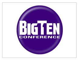
The Big Ten collegiate conference has eleven schools therefore, using the negative space, number “11” is hiding within the logo name
Bistro
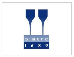
At the first glance you might not see what my eyesight witnesses here?. you would see two wine glasses but I see three wine bottles. What do you see?
Blade
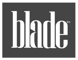
Take a closer look and you will find a knife integrated in the alphabet ?a??it explains the purpose of a blade.
Cafe Melody
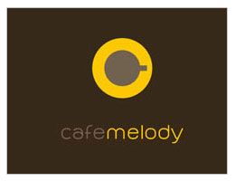
It?s a top view of a coffee cup, creates the alphabet ?C? and on to highlight the melody part it looks like a volume button.
Brand Union
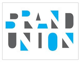
Using different geometrical shapes, the word ?Brand Union? make you confuse while reading it.
Child of the King
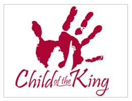
The logo is a clever example of utilizing negative space with a child?s pic integrated in a painted hand print.
Concealed
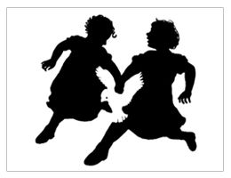
The ?Black and White? graphics show the silhouettes of two running children with a dove forming between their clasped hands.
Fish

You all must think that this logo is an example of brilliant typography rather than negative space utilization but however I think the designer has beautifully used the shape of the fish to merge the alphabets.
etfi

This is a logo for a broadcasting organization but let me highlight the exclusive part of this design?the alphabets “F” and “I” remarkably fit within the letters “E” and “T”
Flightning

If you flip the letter ?f? in opposite direction, you will see an image of a plane taking off.
Fit

The designer has made an attempt to explain the meaning of the word ?fit?. The alphabet ?i? fits in so well that the logo delivers the message clearly.
Elefont

I notice two creative aspects of this logo. An elephant?s trunk is making its way through the letter ?e? and at the same time it makes us pronounce the word ?elephant? in a new way.
Grace Hospice

I can make you find three things in this small logo: A face of a lady with orange hair, a dove and the orange part makes us perceive a tree.
Hammer
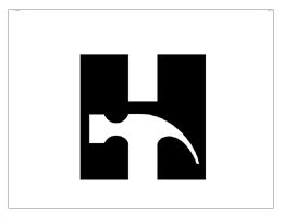
The integration of the letter “H” with the hammer is outstanding and a little difficult to find at first glance.
1 Here There
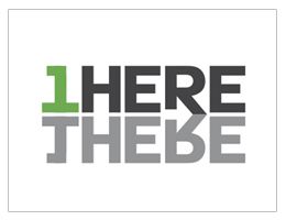
I don?t claim this logo to be a clever example of negative space use. However, utilizing the mirror image, the designer has given a new meaning to the logo, just like negative space logos.
Lady Rocket
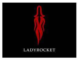
In the first glance you will catch the silhouettes of a lady but on a closer look you will see a rocket outlined in the top part of the figure.
Nicholson
Honestly speaking?I don?t know much about this logo but found it amazingly creative to show the letter ?N?I will really appreciate if any of you could tell about the company this logo belongs to so I can give the real credit.
New Man
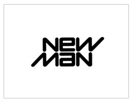
I would add my personal favorite, the reversible Newman logo. This logo is the best example of simple but clever logo?what say?
Hug a Panda
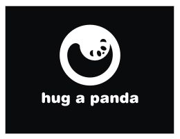
I was amazed to find this cute little panda encircled in this logo?don?t you think this is brilliantly done.
Piece
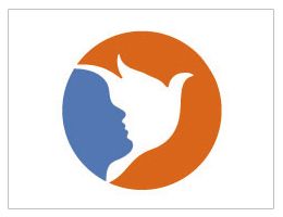
This logo has been designed by Felix Sockwell showing a child?s figure face integrated with a flight of a dove.
Pencil
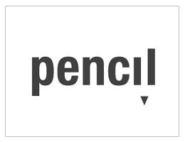
The space between the letters ?i? and ?l? has been carved in a way to look like a pencil.
Piano Forest
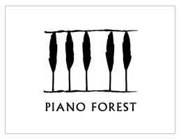
To explain the name of the logo, piano keys have been designed like tall tress of the forest.
Sink IT
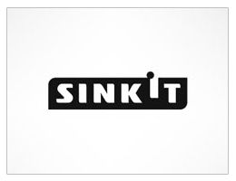
To explain the action of the word, very playfully the designer has made the letter ?i? sink into the negative space?..great idea!!
Treacy Shoes

The hidden shoe packed between the company initials conveys the company message in a very stylish and interesting way. I simply loved it:)
Truce
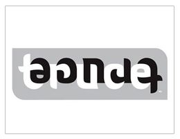
Upside down or backward/forward, no matter in which direction you look at this logo. The designer has made the point that it reads ?truce? from every direction.
Urban Chic

The idea of utilizing the white space between the bristles of comb to portray the urban life makes this logo loveable.
USA Network

It is an old but ever living example of utilizing the negative space. I could not stop myself from praising the stylish integration of letter ?s? in the logo.
Wave

Using the swirls and flows of the waves has been merged here with the negative space to create the word ?Wave?
What?s For Dinner?

The Swirls of the letter ?W? has been utilized to make an image of a waiter who is ready to serve the dinner.
New Castle

To explain the vast catering services of this company, the designer has merged the wine bottles with a fork.
X MAS

The lower space of the letter ?X? creates the image of ?Christmas Tree??nice idea!!
Yoga Australia

At first glance the logo may look like a simple picture of a young girl doing her yoga exercise but if you watch it carefully the body posture is creating the Australia Map.